Create an Account
Create an account for powerful AI tools, award-winning courses, and access to our vibrant community.
or
Already have an account?
Create an account for powerful AI tools, award-winning courses, and access to our vibrant community.
Already have an account?
First thoughts on the leap into practicing my art.
Digital art has come a long way from those days of spending 18 hours on Paintshop Pro, hoping my parents won't turn off the computer while I'm asleep to lose my work. Back then, layers couldn't be saved, at least in the software I was using. It was frustrating to lose 18 hours of work only to start over again, but that was my life in high school trying to move my art from paper and pencil to digital.
Over a decade later, after a significant sidestep into music, I've come back to working on digital art. I have to say that there have been tremendous improvements to the platforms I was angsting over, also, with the advent of platforms like YouTube. Finding tutorials on things that are a struggle that is readily available almost instantaneously is now a breeze.
Some of my favorite channels with tutorials for creating art and digital art are Ethan Becker, DrawingWiffWaffles, Marc Brunet, LavenderTowne, Robert Marzullo, and so many more.
It was pretty easy for me to get back into because I already owned an iPad, and acquiring an Apple Pencil was no problem. I'll mostly be talking about my experiences on that device because it is the main one I am using to date.
There are two applications that I've used, ibisPaint and Procreate. I have pretty good experience with ibisPaint because I had used it for a while now, and Procreate is relatively new to me.
I will compare both of these applications today using the following criteria response to the Apple Pencil, available brushes, how layering works, the functionality of color palettes, and cost.
Both of these apps respond well with the use of Apple Pencil.
This is something that I discovered in some tutorials that your tablet and painting app does respond to pressure and adjusts the thickness of the line based on the pressure applied.
I'm pretty heavyhanded, so this is not something I would have noticed on my own for sure.
I've found that the pressure response is a little better with Procreate than it is in IbisPaint, as well as creating continuous connected lines when having to lift the pencil and then bring it back to the tablet.
I lift the pencil because I adjust the angle and size of the drawing so that my hands can create the best shapes and steadiest lines. This is one of the reasons why I do art and not brain surgery.
Both apps give you access to thousands of brushes. I had to take a day to sit and use every brush to decide which ones I liked for tracing, which ones I liked for coloring, and which ones I liked to use for shading.
As far as brush adjustments themselves, ibisPaint is easier to use due to the application's interface. Creating your specific settings for each brush and saving them is pretty easy in ibisPaint.
While in Procreate, you can super fine-tune what you want each brush to do. It's not as user-friendly for the beginner as ibisPaint in this regard.
There are ways to upload brush sets using both ibisPaint and Procreate, and many YouTubers that do digital art offer them in the links at the end of their videos. I know that Marc Brunet does in the description of his video here.
It would be easier to save the specific brush settings and pulling from that, but I'm one of those who adjust everything to what I need in real-time.
I haven't quite created the set that I like where I can click the brush, do the thing I want to do, and then click the second brush that has the setting for the second thing I want to do. This is one of those things that I really need to take the time to set up and consider in both applications.
As I've described, many people with more experience have done the leg work, so it's just a matter of getting it done on my part. I have to do things the hard way before I do them the easy way.
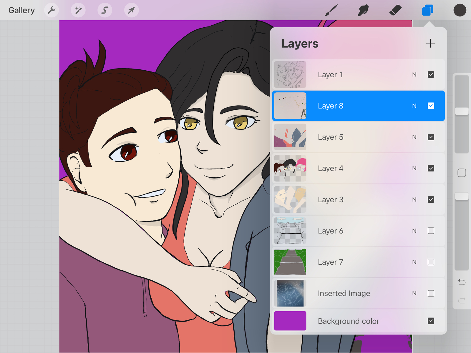
Layering is super important in digital art, especially when changes need to be made to the specific aspect of the work.
I usually put the line art as the top layer, then color in the skin on a layer, hair on another layer, facial features, clothing, and then there are the layers for shading, lighting, and finally creating the background. I also use another layer to make sure there aren't any weird gaps between the colors and the line art.
For the layer that helps bridge the gaps, in Procreate, I use the layer that's labeled "background." This is only fillable with one color. Aside from doing color fill, there's not much else to do with it, so I fill it with an obnoxious color so I can see it poking through easier.
IbisPaint is a different story, however. In ibisPaint, I use the free-hand selection tool to select the outermost lines of the line art, so the entire person is covered. Then I fill in that spot with the color I am going to use for the skin color. After that, I set the layer to divide or invert it so that the color is the opposite of the skin color.
This is one of those instances where ibisPaint wins out on ease of use, is that when you click on the layer menu, you can change the layer blend mode right there. Usually, for the layer I use to shade, I set the layer to multiply.
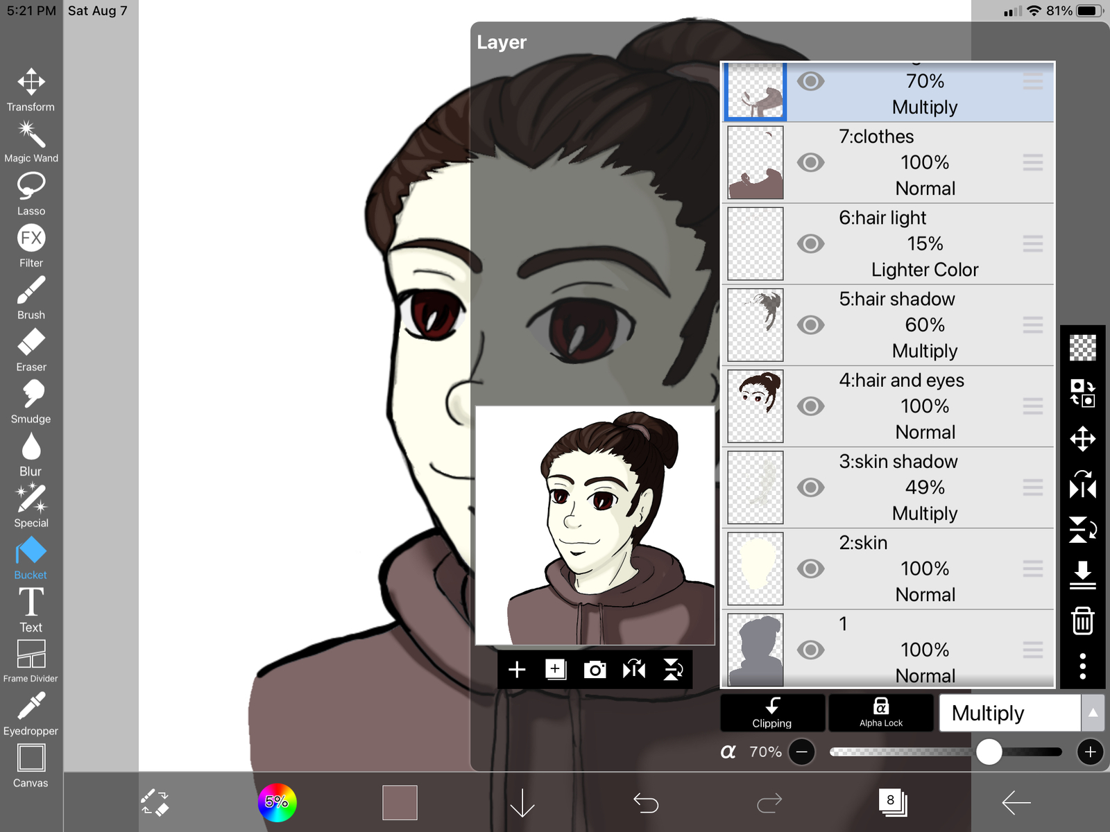
I can also change the opacity from this menu, which is helpful because I'm pretty heavy-handed.
Procreate can also create the same effect, but I've only been able to do this by changing the brush settings. However, inverting the layer to trace my line art off of a drawing has helped make my line art even cleaner in this application overall.
UPDATE: The blend mode in Procreate for the layer is changed by selecting the letter "N" next to the layer name. Now, that I have finally found it I plan to apply the principles I use in ibisPaint for layer blend in Procreate.
The best feature for me in Procreate is the creation of a color palette. In Procreate, I have the option of creating a color palette based on my own choices or have the app analyze a picture and create a palette for me.
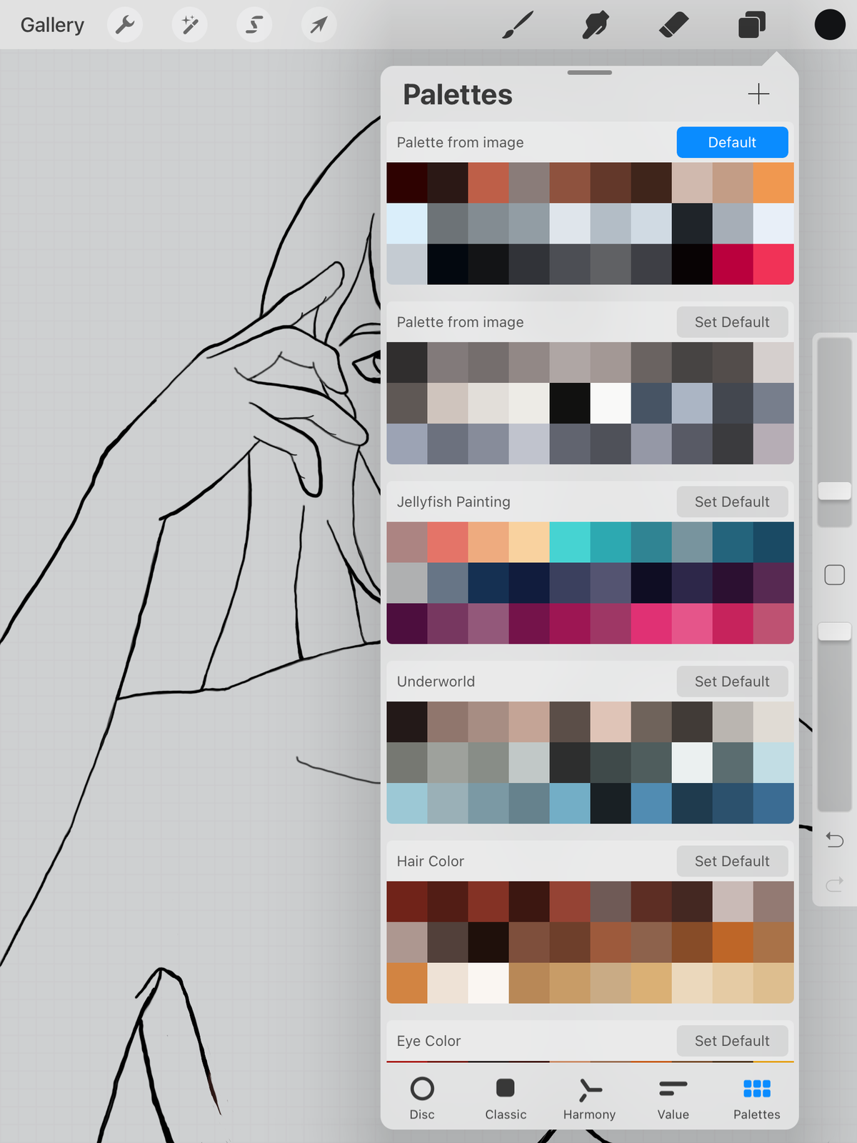
This speeds up the coloring process significantly, and I can choose an overall theme for the colors in the artwork when based on these color palette groupings.
In ibisPaint, I can't separate the colors into specific color palettes. However, I can load an image into its own layer and use the eyedropper tool and then drag the color into the main color palette. It's just a little more time-consuming.
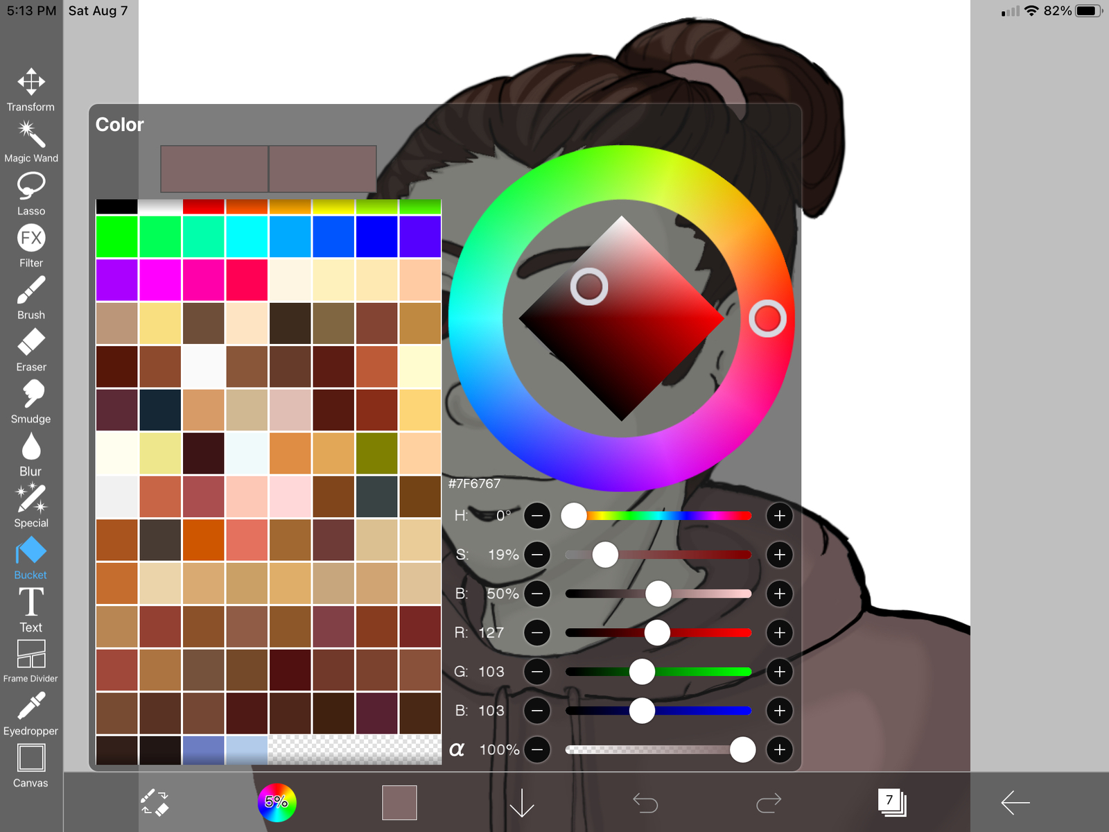
For the colors shown here, I used images of skin tones, eye colors, and hair colors to keep the coloring of my characters more consistent. These are some of my favorite shades I've grabbed using the eyedropper tool.
Cost
This is an interesting point because, as with both of them, they each have their pros and cons.
The free version of ibisPaint gives you access to most of the features. It's just that there are ads everywhere. Also, to gain access to all the brushes for a 24 hour period, you have to watch an ad. This is one of the reasons why I used ibisPaint to start because the free version gives you so much. All you have to do is watch an ad.
The functionality not available in the free version is to move your drawings around in your gallery in ibisPaint. They are just stuck in the order you create them. A monthly fee of $2.99 for a prime membership can fix this. It adds other features, too, but I paid the prime membership mostly so I can group my works together in the way that I wanted to.
There's also a paid version for $8.99, however, it only takes out the ads.
With Procreate, you spend $9.99 for it, and you get everything. There are no additional memberships or anything outside of the $9.99 you pay to download the app. The only thing that can create additional cost would be downloading some of the brush sets, but there are many free ones as well. I just have to download them.
There you have it.
My adventures in digital artistry using the apps ibisPaint and Procreate. Both apps are fantastic and have their own pros and cons. In the end, I guess I can't really recommend one over the other, though I will admit I have been using Procreate more lately. Overall, though, I'm pleased with the results in both apps, and I'm going to share the rendering for the same painting on both platforms. I hope you enjoy them.
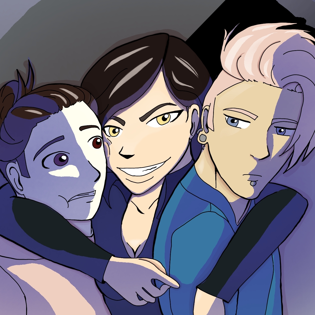
In the above image, I experimented with using blue for the shading and used a color palette based on one I created from an Underworld-style color palette. For the eye shapes and style, I used Avatar the Last Airbender as a reference in this one.
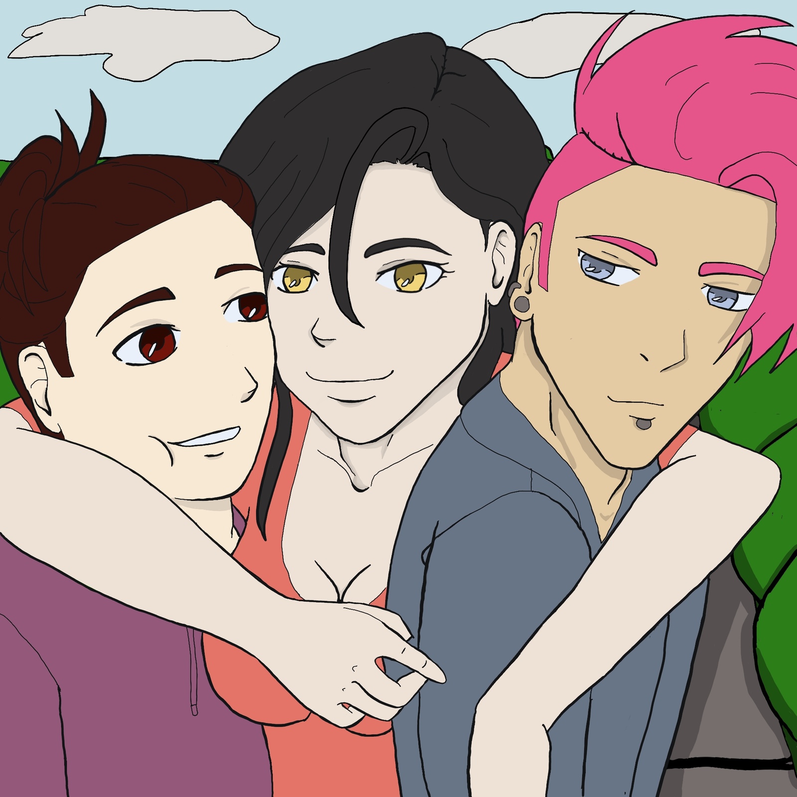
This one uses the same line art as the first image I created in ibisPaint, but with some adjustments. A couple of people noted that my character on the left looked terrified, so I made some adjustments there. I also prefer my eyes to look a little more like the style of Fruits Basket or Horimiya with my own little twist to it.
Want to have Angela Ruiz's latest posts delivered to your inbox?
Share Post